


About the project
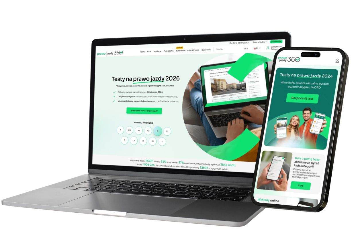
Redesign of the platform and mobile application for a leader in driving theory education in Poland.
Prawo Jazdy 360 is one of the largest platforms for learning driving theory in Poland, operating in both B2C and B2B models. The product had a strong market position, a large user base, and a comprehensive ecosystem of features, but over time it became too complex, visually outdated, and not suited to the dominant mobile usage.
I joined the project at the stage of a mature product. My task was to streamline the user experience, redesign key areas of the platform, and prepare a new interface for the mobile application and B2B panel.
The project was based on a UX audit, user research, feedback analysis, heatmaps, and session recordings.
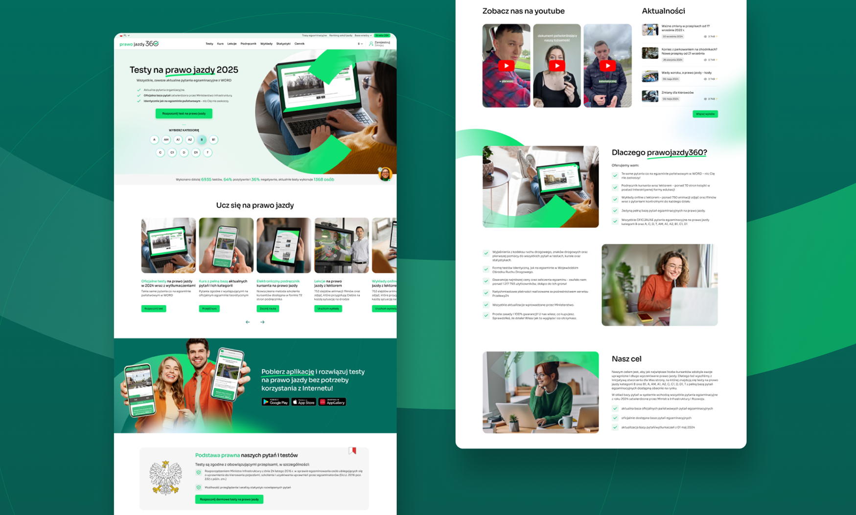
The result of the redesign was a simplification of the product structure, better highlighting of the most important educational features, and about a 10% increase in sales, without negatively impacting the habits of existing users.
My role
I was responsible for the entire UX and product design process, from diagnosing problems to designing new solutions.
UX audit of the existing platform
User research
Redesign of the web platform
Redesign of the B2B panel for driving schools
Redesign of the mobile application
Visual refresh of Branding
Problem
The product had everything users needed, but it did not guide them well enough through the learning process.
- The interface was outdated and hard to read;
- users mainly used tests, skipping other valuable materials;
- the platform structure was too complex;
- the learning path was unclear;
- the mobile experience did not match how the product was actually used;
- the B2B panel needed to simplify the daily work of driving schools.
The problem was not a lack of features, but a lack of hierarchy. The platform offered a lot, but the user did not always know what to do next.
Users and context
The product served two main user groups.
Learners (B2C),
who used the platform to study for the theoretical exam,
Driving schools (B2B),
users managing licenses, accesses, and their profiles on the platform.
Learners studied for the theoretical exam. They used the platform frequently, briefly, and mainly on their phones. They valued a quick return to learning, clear information about their progress, and realistic exam tests.
Driving schools used the B2B panel to manage licenses, learners, and their profiles in the system. They needed simple, operational tools that allowed them to quickly complete daily tasks without navigating a complex interface.
Research and diagnosis
Problems were identified based on several sources:
- conversations with users,
- feedback and review analysis,
- UX audit,
- heatmaps,
- recordings of user sessions.
One of the key areas was the exam tests on mobile devices. Users often accessed them on their phones, but the limited screen space made it difficult to comfortably answer questions.
At the same time, research revealed an important paradox: users claimed that the system was simple for them because they were accustomed to it. Only a step-by-step behavior analysis showed where real friction, unnecessary steps, and ambiguities arose.
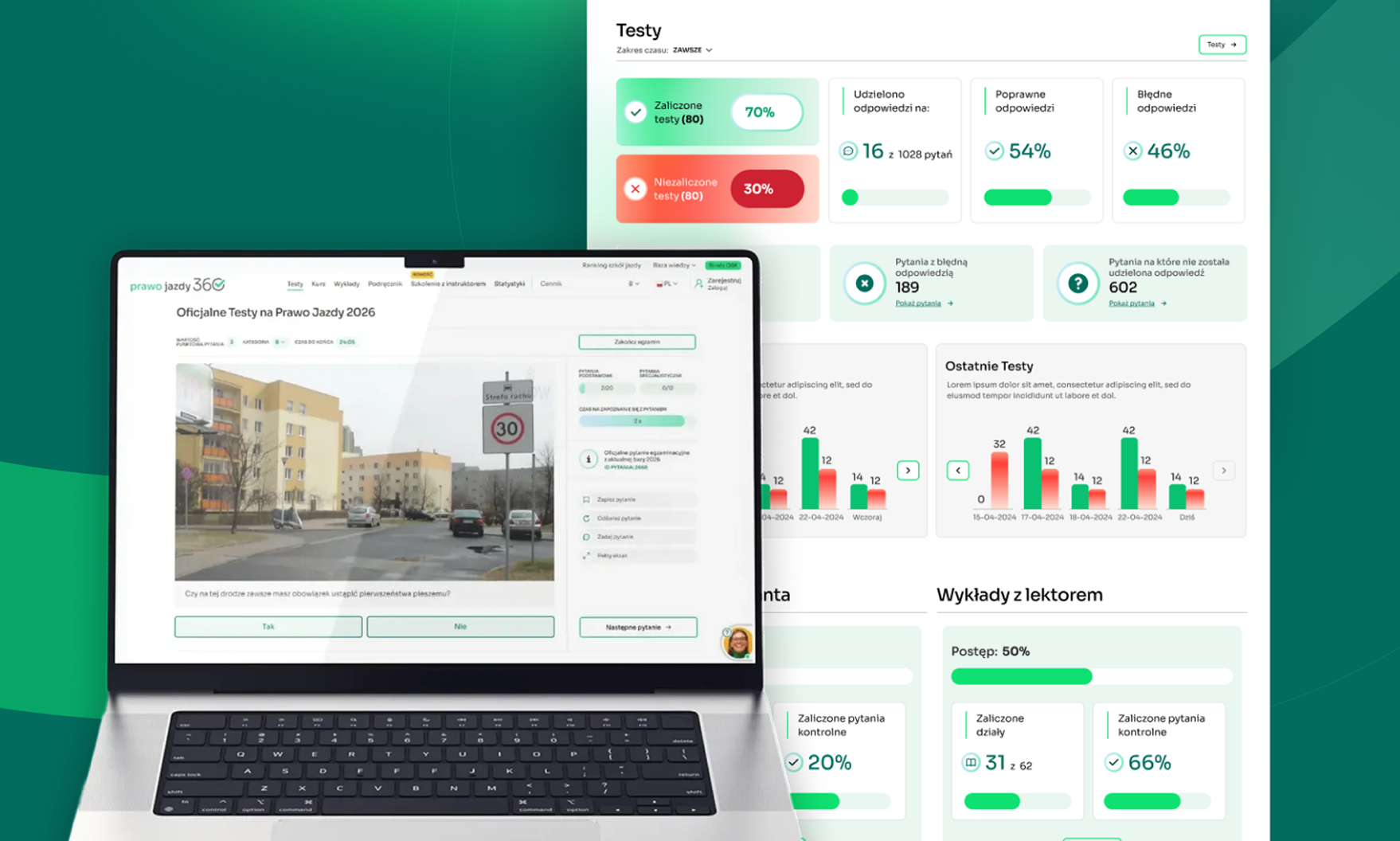
Redesign strategy
I based the redesign on three main assumptions:
- to simplify the product structure,
- to highlight the most important educational features,
- to hide secondary features where they were not immediately needed.
The most important learning elements, such as tests, courses, lectures, and textbooks, were more prominently featured in navigation and key views.
I also placed a strong emphasis on continuity of learning: the user should quickly return to the last place, understand their progress, and know what the next step is.
Mobile application
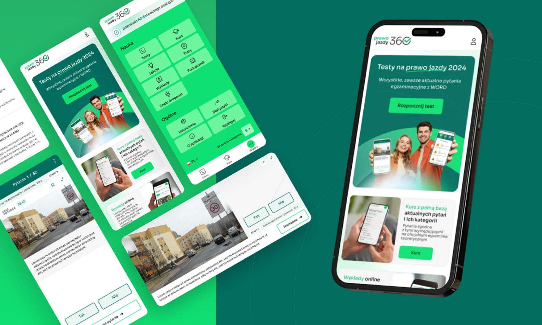
The mobile application was one of the most important areas of the project, as mobile dominated the actual use of the product.
In the redesign, I improved:
- readability of content,
- scaling of elements on small screens,
- hierarchy of views,
- access to tests,
- continuation of learning,
- the way progress is presented.
In some places, I deliberately chose less visually striking solutions, but ones that were more aligned with the actual exam. Tests were not only meant to look good but also to build a sense of familiarity and realism before the actual exam.
B2B panel
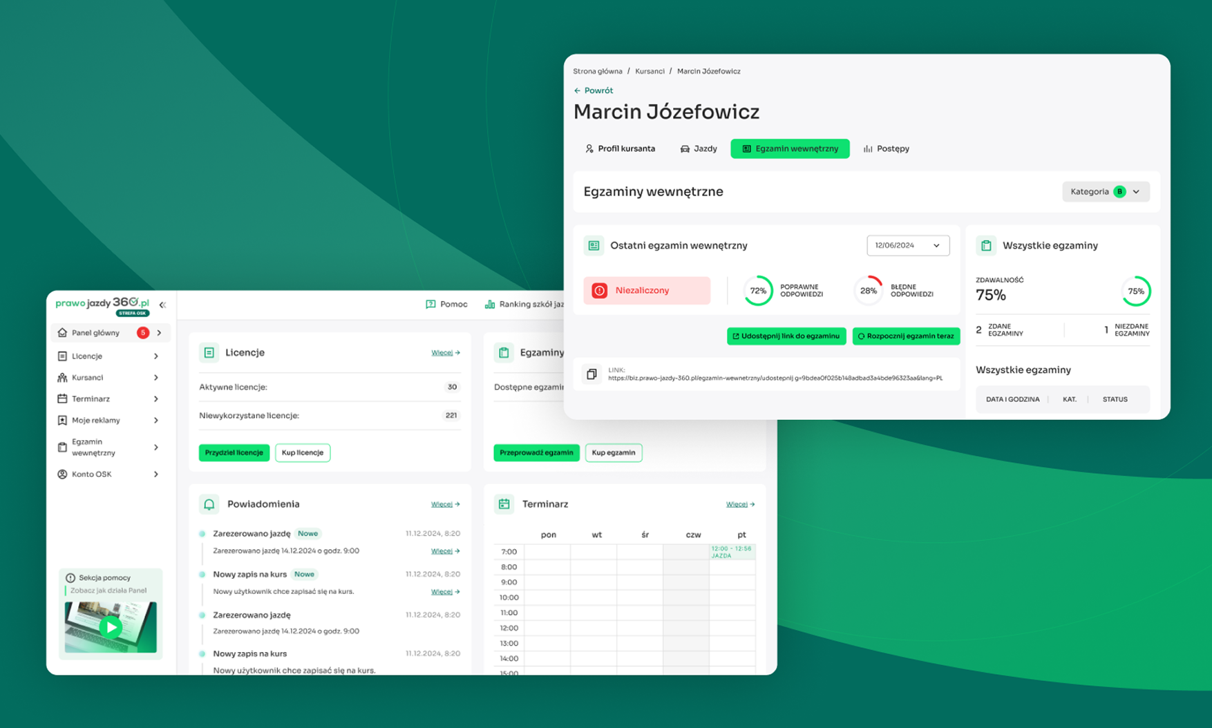
The panel for driving schools was redesigned around the daily tasks of administrators.
The most important actions were brought to the forefront, and the dashboard became the central workspace. The goal was to reduce the number of steps needed to manage licenses, learners, and school data.
In B2B, it was not about a flashy interface. It was about speed, predictability, and fewer decisions on the user’s part.
Implementation of changes
Changes were designed with great caution, as the product had many regular users.
It was not about a revolution for the sake of redesign. The goal was to improve the product without destroying the familiar habits that users had developed over the years.
Therefore, the new solutions organized the structure, improved readability, and shortened paths, but retained the key logic of the product where it was important for existing users.
Effects and conclusions
After implementing the redesign:
the platform maintained its market leader position,
sales increased by about 10%,
users adapted well to the changes,
key educational features became more visible,
the mobile application better matched the actual way of using the product,
the B2B panel became simpler and more operational.
Conclusions
This project clearly demonstrated that in mature digital products, it is often not a lack of features that is the issue. It is a lack of clear structure, priorities, and user guidance.
The most important design decisions did not stem from simply 'refreshing the UI’, but from observing how people actually used the product.
What would I do differently today?
If I were to return to this project today, I would introduce more quantitative experiments and A/B tests earlier to verify key design decisions more quickly on a larger sample of users.