


About EPP
EPP stands as Poland’s largest shopping center manager by rental space.
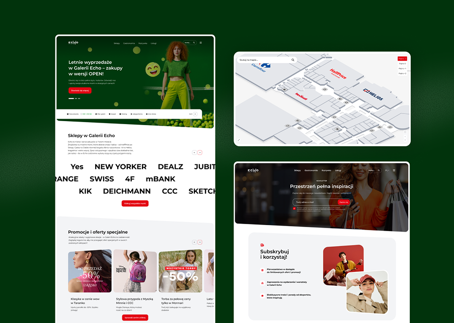
Currently, EPP oversees 27 retail properties and 6 office complexes, with a total portfolio valued at around €2.9 billion. Notable properties include Galeria Młociny in Warsaw, Galeria Echo in Kielce, Pasaż Grunwaldzki in Wrocław, Galaxy in Szczecin, M1 centers, and the Zakopianka Retail Park in Krakow. The project encompassed 25 properties, each requiring a solution that functions effectively in both expansive galleries and shopping parks with varied layouts and offerings.
Problem
We began with 25 distinct shopping center services, each varying in structure, appearance, and information presentation.
- Each property boasted its own visual identity, offerings, and unique characteristics. The shared template needed to cater to both large galleries and retail parks while preserving each brand’s essence. Additionally, the pages had to address diverse user needs: shoppers wanted to know store offerings, visitors needed prep information, and on-site customers sought specific stores or center maps. The challenge was to organize content and functions so users could swiftly find what they needed in any scenario. Thus, we required a flexible system that merged the demands of 25 properties with straightforward usability. The search function, navigation, and access to practical information had to perform well, regardless of the center’s size, branding, or the user’s access time.
My role
I led the design team and was responsible for the complete UX of the multisite platform for 25 shopping centers.
UX Research
Discovery workshop
Redesign of the website
Leading team of designers
I balanced setting the design direction with hands-on work on solutions. I analyzed existing services and user needs, developed personas and requirements, and translated them into the information architecture and wireframes for the entire platform.
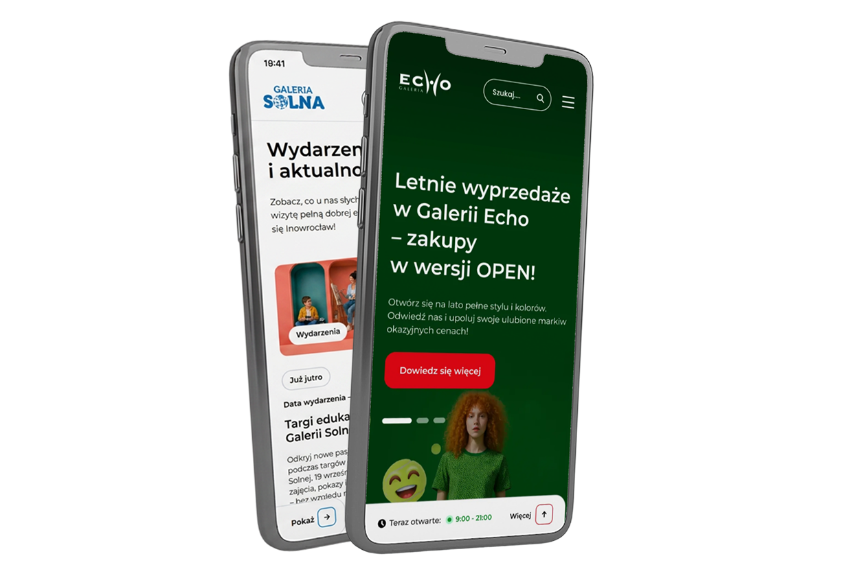
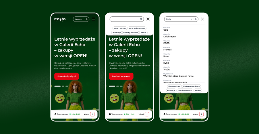
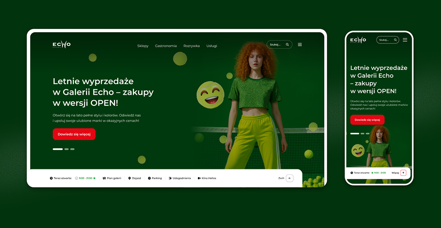
I designed key features, including a search function with suggestions, a quick access bar for essential information, and the display of opening hours. I also conceptualized how to adapt one template to various visual identities, using a neutral base and each brand’s accent color. I co-created the UI, focusing on more complex subpages and ensuring the visual layer aligned with UX principles and the needs of individual centers.
Solutions
How we addressed user needs.
We conducted user interviews,
observed real-world interactions, tested designed solutions, and analyzed existing processes and materials.
In addition to redesigning the pages,
we have changed their architecture and added a range of features to facilitate site exploration and access to key information.
We began by analyzing existing services and identifying individual personas’ needs. The common goal was to quickly find information, but its importance varied based on the visit’s timing. We structured the platform around these scenarios.
For those planning shopping, we organized store presentations and offerings. An advanced search function with suggestions enabled users to find specific locations or information while discovering related content. Users could start searching immediately, without needing to grasp the entire site structure. For visitors from other cities, we provided quick access to pre-trip information. A pull-up bar at the bottom of the screen accompanied users while browsing, allowing them to check from anywhere: directions to the center, hours of operation, and property maps.
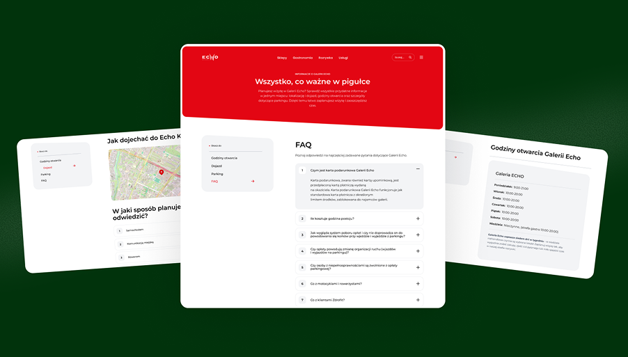
For those already on-site looking for a specific store, interactive maps facilitated store locations and navigation within the property. Accessing the map from a fixed bar streamlined this function, especially useful for mobile users. Additionally, all informational subpages were designed for readability, presenting key information in a Q&A format, with added navigation for quick linking between pages. We merged all functions into one adaptable template. A neutral grayscale and a primary accent color allowed the interface to fit 25 different visual identities, ensuring each center maintained its unique character while providing users with a consistent and predictable experience.
Results and Conclusions
After launching new pages based on the multisite template: