


About GASPOL
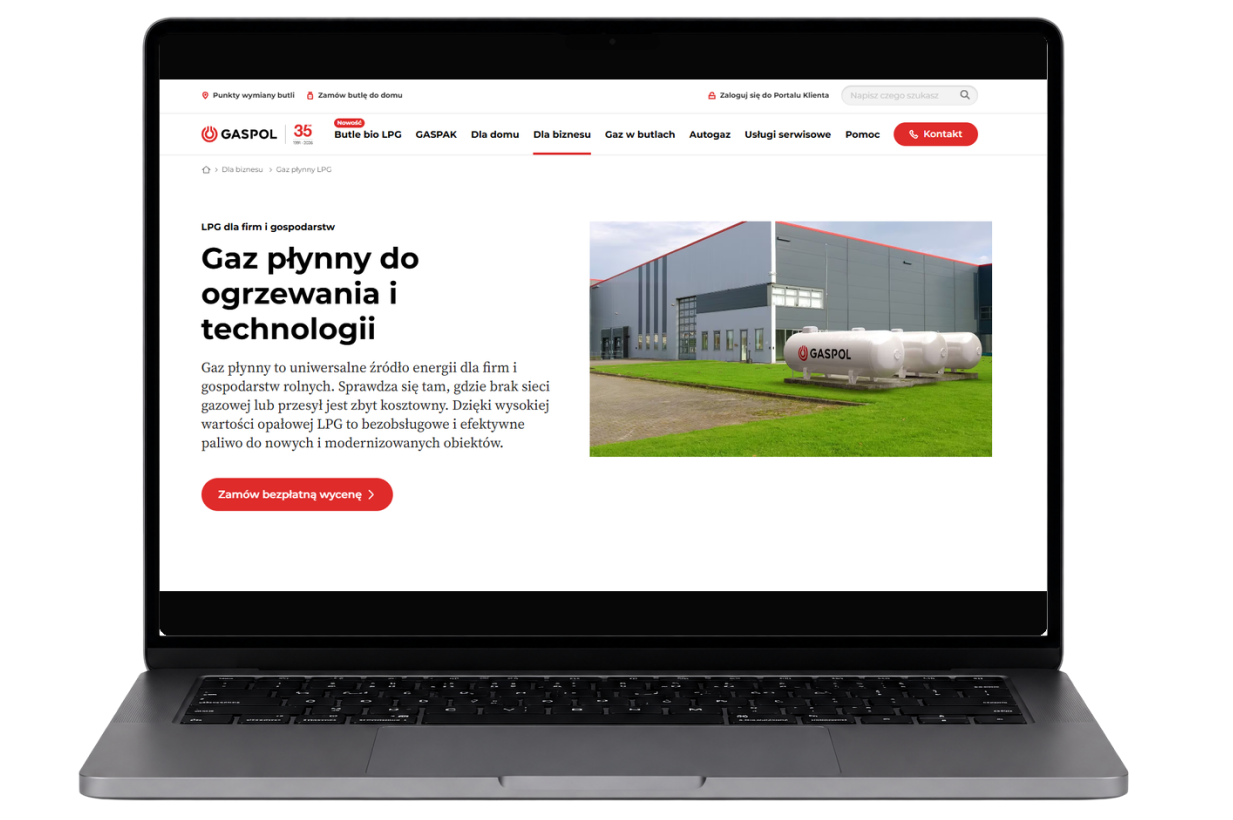
GASPOL is a key player in the Polish LPG market, catering to both individual and business clients. With a wide range of offerings and varying user needs, the website features numerous contents, subpages, and contact options.
Thus, the main goal of this project was not just to create a single view, but to analyze the overall user experience and pinpoint areas that truly need enhancement.

Problem
The biggest issue was not a specific interface element, but the lack of consistency across the entire experience.
The service exhibited significant variation in communication styles, structure, appearance, and the behavior of similar elements. There were inconsistencies in forms, fonts, and components, with key visuals not aligning and elements that looked or functioned differently despite having similar purposes.
Additionally, issues arose in information architecture, content linking, information hierarchy, and user navigation through the service. Some solutions needed to be verified for implementation quality and whether a cohesive design system truly supported the existing interface.
Therefore, the audit aimed not only to identify errors but also to comprehend where and why the service fails to operate as a unified product.
What I did
I conducted a full expert analysis of the service and analyzed data from Microsoft Clarity and Google Analytics.
The entire service
I analyzed all subpages, key paths, navigation, linking, forms, and information structure.
Behavioral data
I verified user behaviors in Microsoft Clarity and Google Analytics, including heatmaps for 20 subpages.
Consistency and UI system
I checked typography, components, key visuals, pattern repeatability, and inconsistencies between different areas of the service.
Recommendations and mockups
I prepared 136 recommendations and mocked up 9 selected solutions to illustrate possible directions for change.
I conducted a thorough analysis of the service, examining everything from its structural framework to individual components and interactions. This included evaluating the information architecture, communication, visual consistency, and the functionality of recurring elements. Additionally, I developed personas to guide the assessment of key user paths and scenarios.
By comparing expert insights with actual user behaviors, I utilized data from Microsoft Clarity and Google Analytics to pinpoint the issues that genuinely impact service usage and identify areas needing improvement.
The outcome was a comprehensive 71-page report featuring 136 observations and recommendations, highlighting 15 critical issues. For 9 selected topics, I also created mockups that illustrated potential solutions and directions for change.
Effects and conclusions
The audit organized the issues of the entire service and prioritized them, creating a concrete basis for further design and implementation decisions.
136 recommendations including 15 critical issues
20 subpages verified based on heatmaps
9 solutions additionally presented in the form of mockups
71 pages of a comprehensive report
The greatest value of the audit was the integration of several perspectives: the structure of the service, UI consistency, user needs, and actual behavioral data.
As a result, the recommendations were not solely based on expert evaluation but were grounded in the broader context of the entire product and could be treated as a real roadmap for the further development of the service.