


About eSesja
eSesja is an advanced system supporting the work of Polish local governments, including the organization of meetings, distribution of materials, and conducting votes.
According to current data, the system serves over 1,100 clients, and its public statistics show over 76,000 users, 419,000 meetings, and 1.9 million votes conducted. eSesja
In 2024, MWC eSesja took first place in the „IT Product of the Year in Administration” poll in the category of software dedicated to public administration. IT in Administration
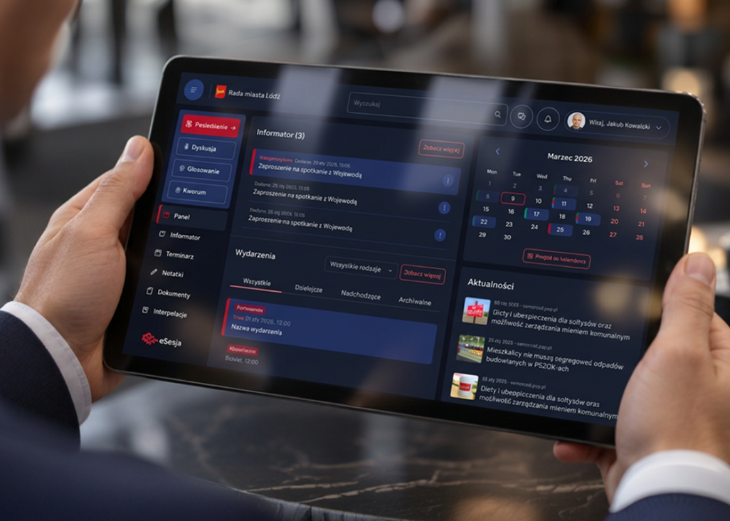
The project concerned a new version of the application for councillors, which is a tool used in a very specific context: during preparation for meetings and during the session itself, when the user needs to quickly find information, work with documents, and respond to live events.
Problem
The application worked, but it did not support the entire work of the councillor.
The previous version was a relatively simple tool, primarily used during votes. A significant part of the functionality was on one screen, responsiveness was limited, and interface elements could compete for space or obscure each other.
However, the problem did not end with the appearance. The chat was a single common channel for all users of a given council and did not meet the actual communication needs. Councillors therefore used external communicators in parallel.
Documents related to specific agenda items could not be opened directly in the application. Notes existed but were not aggregated in one place, making it difficult to return to them later. The calendar showed that something was happening that day, but did not function as a real schedule.
Access to settings was limited, there was no dark mode, login issues occurred, and the application did not meet the basic accessibility requirements of WCAG 2.2, which we wanted to include in the new version.
My role
From identifying issues with the old product to a reliable solution prepared for development.
UX Research
A full audit of the existing application, user interviews, and analysis of surveys, opinions, and data.
Discovery and roadmap
Workshops with the client, defining product direction, priorities, and participation in building the roadmap.
Product Design
Information architecture, UX, UI, and a new operating model for the application designed with a tablet-first approach.
Prototype and testing
An interactive prototype in Figma, user testing, feedback analysis, and further iterations before handoff.
Design Leadership
Leading design on the project side and substantive supervision over the related project of the new eSesja website.
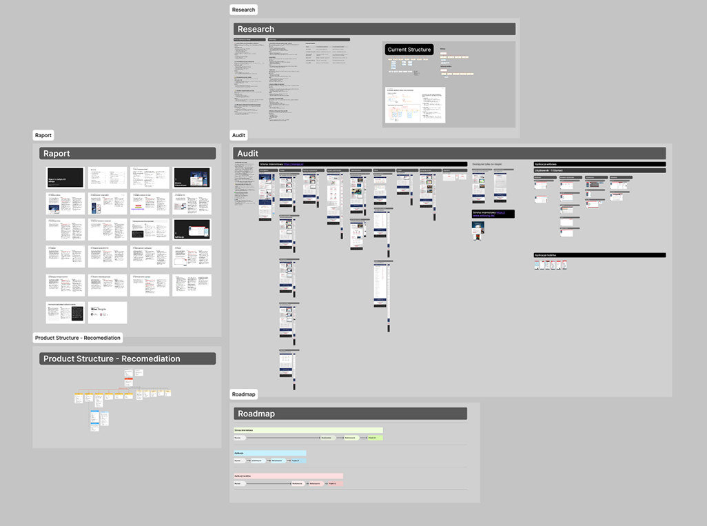
My work began much earlier than designing new screens. First, I conducted a comprehensive audit of the existing application, culminating in an extensive report of issues and recommendations. Then I led discovery activities, participated in the product roadmap work, and conducted a series of in-depth interviews with councillors and council chairs.
I also analyzed surveys, previous user suggestions, opinions, and available data on system usage.
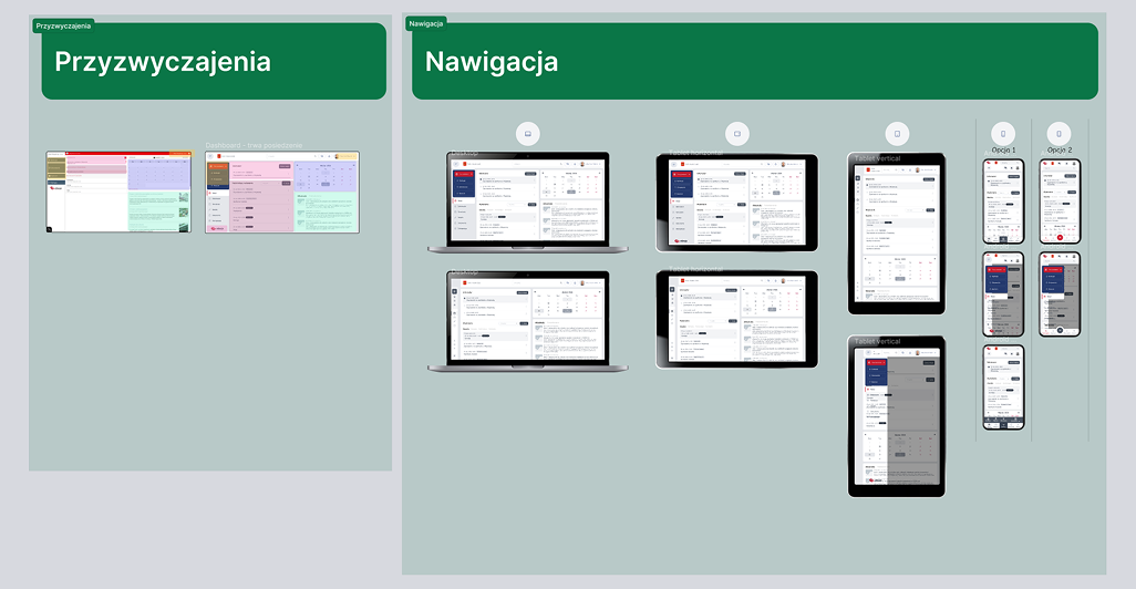
Based on the collected information, I designed a new application architecture, navigation method, key scenarios, and the product’s UX and UI. The main context was the tablet, but the project also included full behaviors for desktop and mobile. I connected key paths in an interactive Figma prototype, which was used during user testing. Feedback from the tests went directly into subsequent iterations of the project.
My responsibility also encompassed the broader eSesja ecosystem. I led the design of the project on our side, worked directly with the client on product development direction, and in a separate stream concerning the website service, participated in discovery, then handed the project over to another designer and provided substantive supervision over her work.
The application project is currently at the implementation stage.
Solutions
Instead of improving individual screens, I rebuilt the entire application’s operation.
One application instead of several tools.
The most important assumption was not to add more functions but to limit situations in which a councillor has to leave eSesja.
Research indicated that during one meeting, a user could simultaneously use eSesja, a communicator, documents opened in another program, and a separate place for notes. I wanted to gather this context in one product.
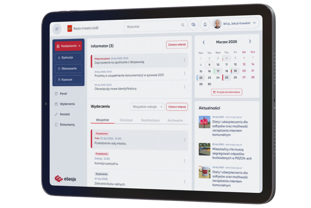
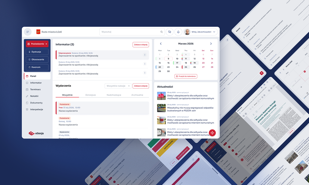
Therefore, I rebuilt the application’s architecture. Instead of one dashboard where most functions were located, a permanent top bar was created with the most important context, profile, settings, notifications, and a communicator, along with side navigation leading to specific areas of the system.
Documents can now be opened directly during the session, notes are aggregated and searchable, and the calendar has become a full schedule with day, week, month, and list views. I also added a predictive search feature because, with the increasing number of meetings, documents, and notes, one cannot expect the user to remember where each piece of information is located.
Tablet first, because that’s how councillors really work.
The tablet-first approach was not a stylistic decision. Research showed that during meetings, the primary device for councillors is often the work tablet provided to them specifically for working with the system.
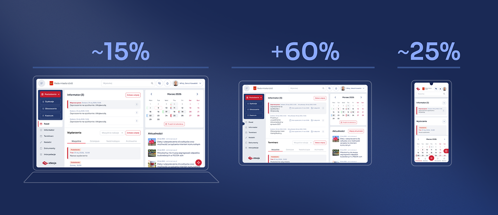
Therefore, I designed the main variant of the application for the tablet, not for the desktop, which would later just be scaled down. The layout is fluid, and individual areas can change their proportions depending on the task being performed.
At the same time, councillors also use eSesja outside of the meeting itself when preparing for the next session, reading documents, or checking the schedule. They may then use a personal computer or phone, which is why we ensured full responsiveness. Mobile received its own layout and behaviors, not a compressed version of the tablet view.
In the process, we also rebuilt access to the product. The project includes 2FA, login via mObywatel, and more convenient login using a QR code. This makes using eSesja on different devices not only simpler but also safer.
Different application during meetings, different between sessions.
One of the more important conclusions from the research was noticing that the same user uses eSesja in two completely different situations.
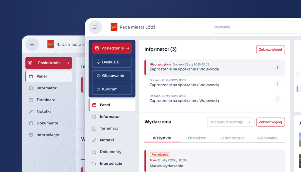
During an active meeting, the most important aspects are the current session, voting, quorum, documents, and quick access to information needed at that moment. Between meetings, voting or quorum are irrelevant. At that time, the user wants to check the next meeting, read materials, return to notes, or check messages.
Therefore, the interface changes depending on whether a session is ongoing. We do not show the user all the product’s possibilities all the time, only those that are relevant at that moment.
Working without losing context.
In the old application, many actions meant going to another screen or exiting to another application. In the new version, I focused on contextual work.
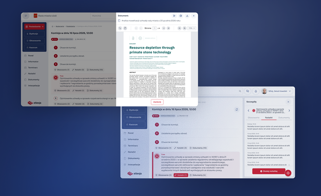
Documents, notes, or additional information are located within the application and can open in a side panel without leaving the current session. The user still sees where they are and what the material they are currently working on is about.
We treated communication similarly. One global chat was replaced with a communicator featuring private and group conversations, the ability to create custom groups, and send files and photos. This was partly to ensure that councillors did not have to move discussions about council work to WhatsApp.
The application reacts to what is happening during the session.
Research also revealed a very specific problem with voting. A councillor could be physically present at the meeting but temporarily using another application and not notice that voting had just begun.
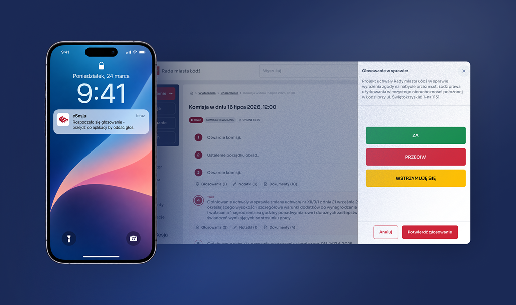
Therefore, we designed a notification system, including push notifications about the start of voting. Instead of requiring the user to constantly monitor the eSesja screen, the product draws their attention when something important happens.
AI as another way to access information.
We also added an internal AI assistant to the new version. Its task is not to replace classic navigation or search but to create an additional way to work with the increasing amount of information in the system.
The assistant is meant to help find information and work with documents without the need to manually search through various materials. This way, eSesja is no longer just a place where the user performs specific actions, but can also help them find the necessary context.
Iterations with users instead of revolutions.
The new product was to be much better, but it could not force thousands of users to learn everything from scratch.
One of the biggest challenges was the scale of the existing user base. Although the old application required a complete overhaul, completely changing its key elements would simply create another problem. Councillors use eSesja during real meetings and have developed specific habits over the years, so we retained the placement of key functions, including voting and quorum. We changed the architecture, operating model, and capabilities of the application, but at the most important moments, the user can still rely on their memory and existing habits.
Not everything worked out the first time. A good example was the Informant, which we initially treated as another type of event. It only became clear later in the process that it serves a completely different role and requires the councillor to familiarize themselves with specific information. We had to return to earlier decisions and rebuild that part. Several iterations were also required for mobile navigation. The first versions diverged too much from the expected way of using the product, and subsequent iterations led to a simpler solution and a clearer division of the application into active session mode and work between meetings.
To avoid discovering such errors only after implementation, I connected key scenarios in an interactive prototype in Figma. Users could actually go through the new application, check the navigation, contextual transitions, and key functions, rather than just viewing static mockups. The prototype was used during user testing, and the feedback collected went directly into subsequent iterations before handoff.
Results and Conclusions
The redesign transformed eSesja from a voting tool into a complete working environment for councillors.
Everything a councillor needs before and during a session is in one place.
Documents, notes, and information about the meeting are accessible without leaving the application.
Notifications help not to miss a vote or important information during the session.
An interface tailored to the context of use, different during sessions, different during preparations.
Safer and simpler login.
Communication with other councillors no longer requires moving conversations to external communicators.
Predictive search, internal explorers, schedule, and AI assistant support navigation through the extensive application.
The most important effect of the redesign is not the number of new functions but the integration of the entire workflow of the councillor into one product. eSesja no longer ends with voting. The user can prepare for the meeting, work with documents and notes, communicate with other councillors, participate in the session, and return to the necessary information without piecing together their work from several different tools.
At the same time, we managed to significantly expand the product without cutting users off from what they already knew. The most important functions remained in familiar places, but around them, a new contextual working model was created. Testing the interactive prototype confirmed that this direction is clear for users, and their feedback allowed us to refine solutions even before implementation.
The biggest change was not the addition of more functions. It was making it so that a councillor no longer has to leave the eSesja application to do their work.